
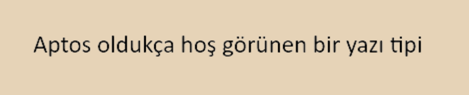
In the applications I use, typography is a subject I am very sensitive about. Last year, Microsoft changed the default font of its office applications, switching from Calibri to Aptos. This was a wonderful change. Calibri is one of the most frequently seen fonts. Along with Arial, another very common font, these two fonts make me extremely uncomfortable. Aptos has fixed many of its weaknesses and has become an objectively more legible font in every sense.
Besides this, I have some subjective thoughts. For me, the lowercase letter ‘a’ is one of the most important features determining how aesthetic a font is. First, let’s define the word allograph. In the context of typography, this refers to expressing the same letters in different shapes. The lowercase letter ‘a’ has two allographs. The most common one in the digital medium is the ‘a’ that looks like it’s wearing a hat, which we see in classic fonts like Calibri, Arial, and Times New Roman. This is called the double-story ‘a’. The other is the ‘a’ we see when learning handwriting, which we express by drawing a vertical line to the right of a lowercase ‘o’. This allograph is called the single-story ‘a’.
For me, it is absolutely essential that the font I choose in environments I manage myself, such as my blog or note applications, expresses the lowercase letter ‘a’ with the single-story ‘a’ allograph.

There are some difficulties in using fonts that use the proportionally rare single-story lowercase ‘a’ allograph. First of all, the most frequent problem I encounter is the lack of Turkish characters in many of these already rarely used fonts. Furthermore, there is no example of it among universally available fonts like Calibri, Arial, and Times New Roman. Therefore, the necessity of discovering a different font for each platform arises. For example, the most common font using the single-story lowercase ‘a’ allograph might be Futura, but this font is not available on every platform. The remaining problems are usually design-related. This has two aspects. Either the font mimics handwriting or it has custom design elements. The most well-known example of fonts mimicking handwriting is Comic Sans, and it is probably at the top of the most hated fonts. It is also a font I cannot bear to look at. By custom design elements, I mean “flashy” elements intended for tasks like signage and logo design. Since their legibility in a paragraph is already very low, their use is even less likely than Comic Sans.

The fonts I see most often and enjoy using that employ the single-story lowercase ‘a’ allograph are Poppins, Century Gothic, and Josefin Sans. Among these, the one that looks most aesthetic to me is Century Gothic with its line thickness and rounder edges, but it is not available on every platform. For example, on this blog platform, I had to use Josefin Sans. Josefin Sans is also a beautiful font and can be selected on almost every platform. Although the slightly slanted lowercase ‘e’s seemed strange to my eye at first, I started to like it over time. Poppins, on the other hand, might be the most unobtrusive font and the most suitable to use as a standard. It has no eye-catching elements and is very simple.
I hope that in the future, Microsoft’s new font after Aptos will be one that uses a single-story lowercase ‘a’ allograph.